×
This is the optional category header for the Suggestion Box.
configurable icon and text size
11 years 1 week ago #709
by Dennis
configurable icon and text size was created by Dennis
Hello,
I've had the idea of configurable icon and text sizes, maybe simply in three presets: small - medium - large, because different devices have differing screen sizes. Same goes for the pop-up notifications and pop-up control elements - they could be bigger when viewed on Dektop, but preferably a little smaller on iPad and much smaller on smartphones..
What do you think?
regards
Please Log in or Create an account to join the conversation.
11 years 1 week ago #713
by Xavier
Replied by Xavier on topic configurable icon and text size
I totally agree. Display could be enhanced for small screens. On large screens you can zoom in the page. But on small one you can't resize that much because elements have a minimal size.
I think the easier for EasyIoT would be to reduce that minimal size, but I may be wrong... And maybe it's not first priority for him.
I think the easier for EasyIoT would be to reduce that minimal size, but I may be wrong... And maybe it's not first priority for him.
Please Log in or Create an account to join the conversation.
11 years 1 week ago #716
by cdj
I agree, but the answer was TURN OF 90° YOUR PHONE
Replied by cdj on topic configurable icon and text size
cdj wrote: Hi,
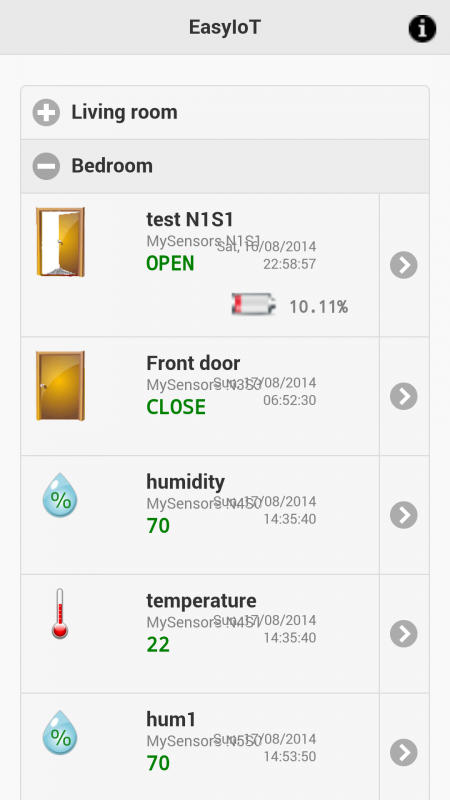
i've just installed last version, but also in beta (and don't know in old version) we have some bad chars that can see well in mobile interface. I suppose that a screenshot can explain better
I'm using Android 4.4.2 running on Samsung Galaxy S5
Thanks
Dario
I agree, but the answer was TURN OF 90° YOUR PHONE
Please Log in or Create an account to join the conversation.
Time to create page: 0.405 seconds
Forum latest
- No posts to display.
